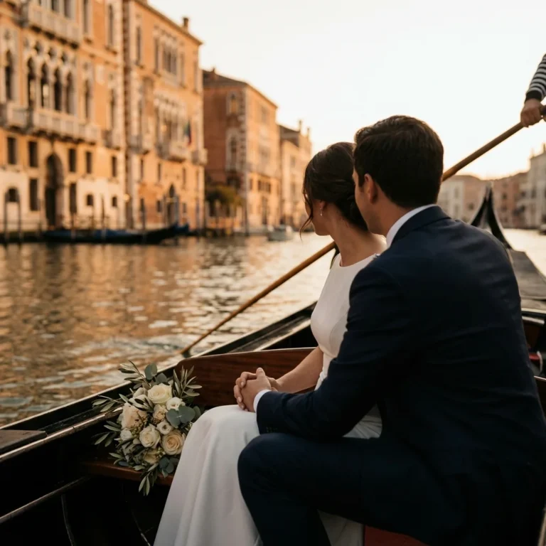
“Why does the palette we love online look completely different at our venue?” It’s the most common design question we hear from international couples after their first site visit—because Italian stone, sea glare, and candlelit interiors change color faster than any screen preview can predict.
Italian Wedding Color Palette
An Italian wedding color palette is a coordinated set of 3–5 tones chosen to complement a specific region’s materials, seasonal light, and venue architecture—then applied consistently across florals, stationery, linens, and lighting. At Kiss Me Italy, we curate each palette as a full design brief—not a mood board—and manage its execution end-to-end so every element reads as one cohesive visual story.
Why the Same Color Reads Differently Against Tuscan Stone, Coastal Pastel, and Lakeside Marble
Color is not abstract. It interacts with the material it sits beside. A dusty-rose linen draped over a table inside a Tuscan stone villa absorbs the warm undertones of the surrounding walls and reads as a muted, earthy blush. Move that same linen to a whitewashed terrace in Ravello, and it suddenly appears pinker, cooler, almost candy-like against the bright Mediterranean backdrop. Place it in a neoclassical ballroom on Lake Como, and the marble floors push the tone toward mauve.
This is not a minor aesthetic footnote. It determines whether your wedding photographs feel intentional or accidental. Our team manages this by requesting fabric swatches, floral mock-ups, and stationery proofs that are reviewed on-site—inside the actual venue, at the time of day the reception will take place. For a September wedding at a hilltop estate outside Siena, that means testing linens at 5:30 p.m. when golden-hour light enters the loggia at a low angle. For a June celebration on the Amalfi Coast, it means evaluating tablescapes under the overhead noon sun that dominates the aperitivo hour.
The coordination step most couples never consider: we share venue-material samples with the wedding photographer during the planning phase, so the photographer can advise on which tones will hold detail in highlights and shadows. This is how an Italian wedding color palette moves from “pretty on screen” to “stunning in print.”
Six Italian Wedding Color Schemes We Curate Most Often—and Where Each Performs Best
We do not offer unlimited options. Luxury is editing. Below are the six Italian wedding color schemes our team builds most frequently, each tied to a specific region, season, and venue type. Every palette includes a dominant tone, a secondary tone, a metallic or neutral anchor, and one accent used sparingly.
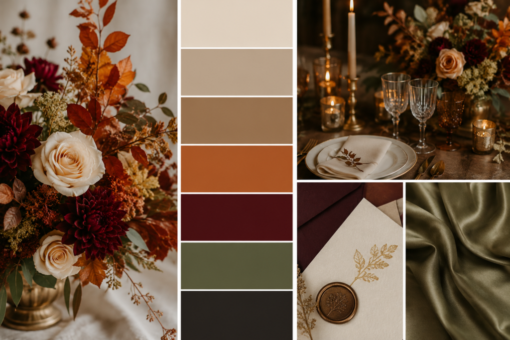
Tuscan Harvest: Terracotta, Sage, Warm Ivory, Antique Gold
Best for: September–October weddings at stone farmhouses, vineyard estates, and hilltop villas in Chianti, Val d’Orcia, or the Versilia coast. The Tuscan wedding color palette draws directly from the landscape—cypress green, sunbaked clay, dried grasses. We keep florals textural rather than lush: olive branches, dried pampas, garden roses in apricot tones. Stationery uses handmade Amalfi paper with torn edges and gold-foil details. This palette photographs exceptionally well in the warm, low-angle light that defines Tuscan wedding venues from late August through mid-November.
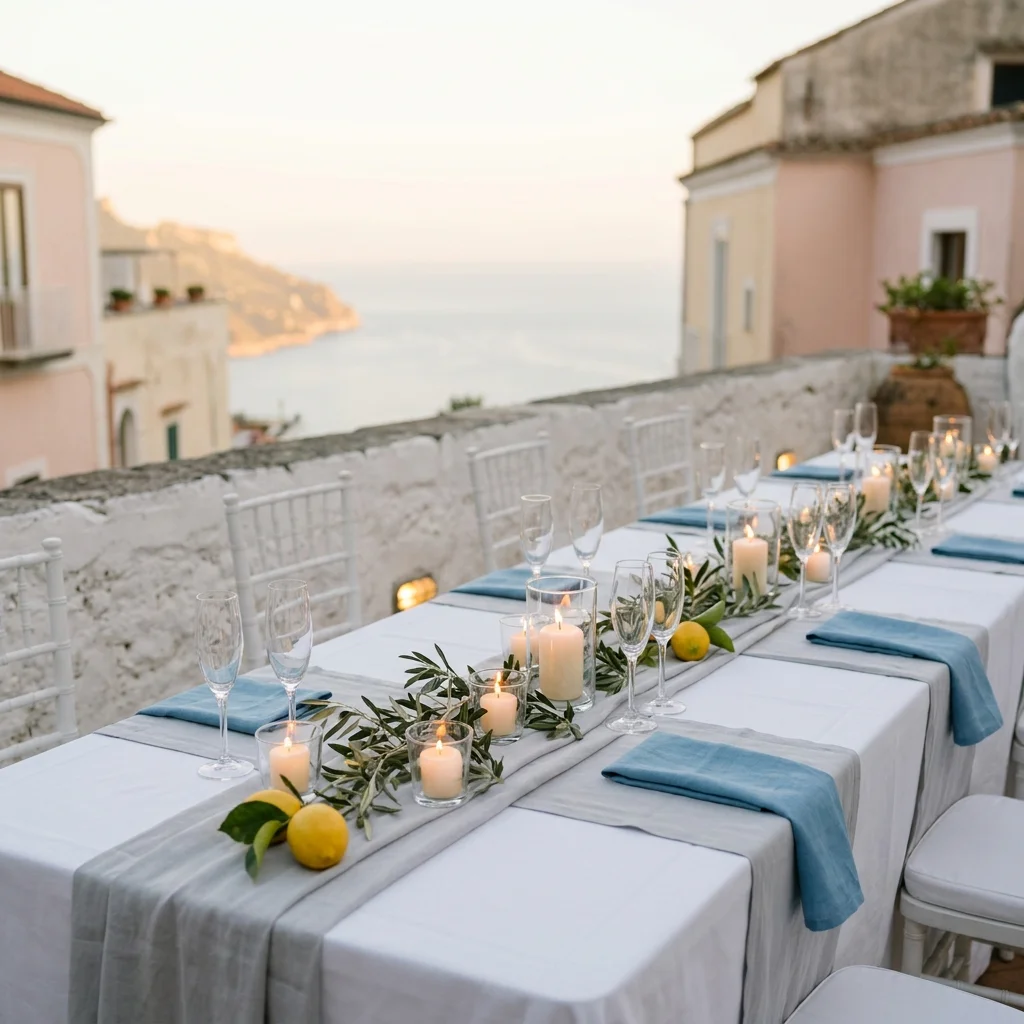
Coastal Cerulean: Ocean Blue, Crisp White, Lemon Gold, Soft Grey
Best for: May–July weddings along the Amalfi Coast, Capri, or the Ligurian Riviera. The Amalfi Coast wedding colors respond to the intense Mediterranean light and the pastel-painted architecture of Positano and Ravello. We avoid saturated navy—it absorbs too much heat visually and competes with the sea. Instead, we use a washed cerulean that echoes the water without mimicking it. Lemons appear as table accents, not as a theme. The grey anchor prevents the palette from feeling “beachy.” Couples considering this region often begin by reviewing Amalfi Coast wedding cost structures, and we integrate palette planning into the initial design consultation.
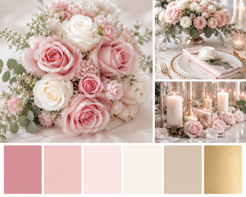
Lakeside Dusk: Soft Blush, Stone Grey, Champagne, Muted Greenery
Best for: June–September weddings at neoclassical villas on Lake Como or Lake Garda. The Lake Como wedding color palette works with the marble, the manicured boxwood hedges, and the silvery light that reflects off the water in late afternoon. Blush here is not pink—it is a barely-there warmth, almost nude. We pair it with grey linens that echo the stone balustrades and champagne metallics in flatware and candleholders. Florals are peonies (May–June only), ranunculus, and trailing jasmine. This palette demands restraint; excess color fights the architecture.
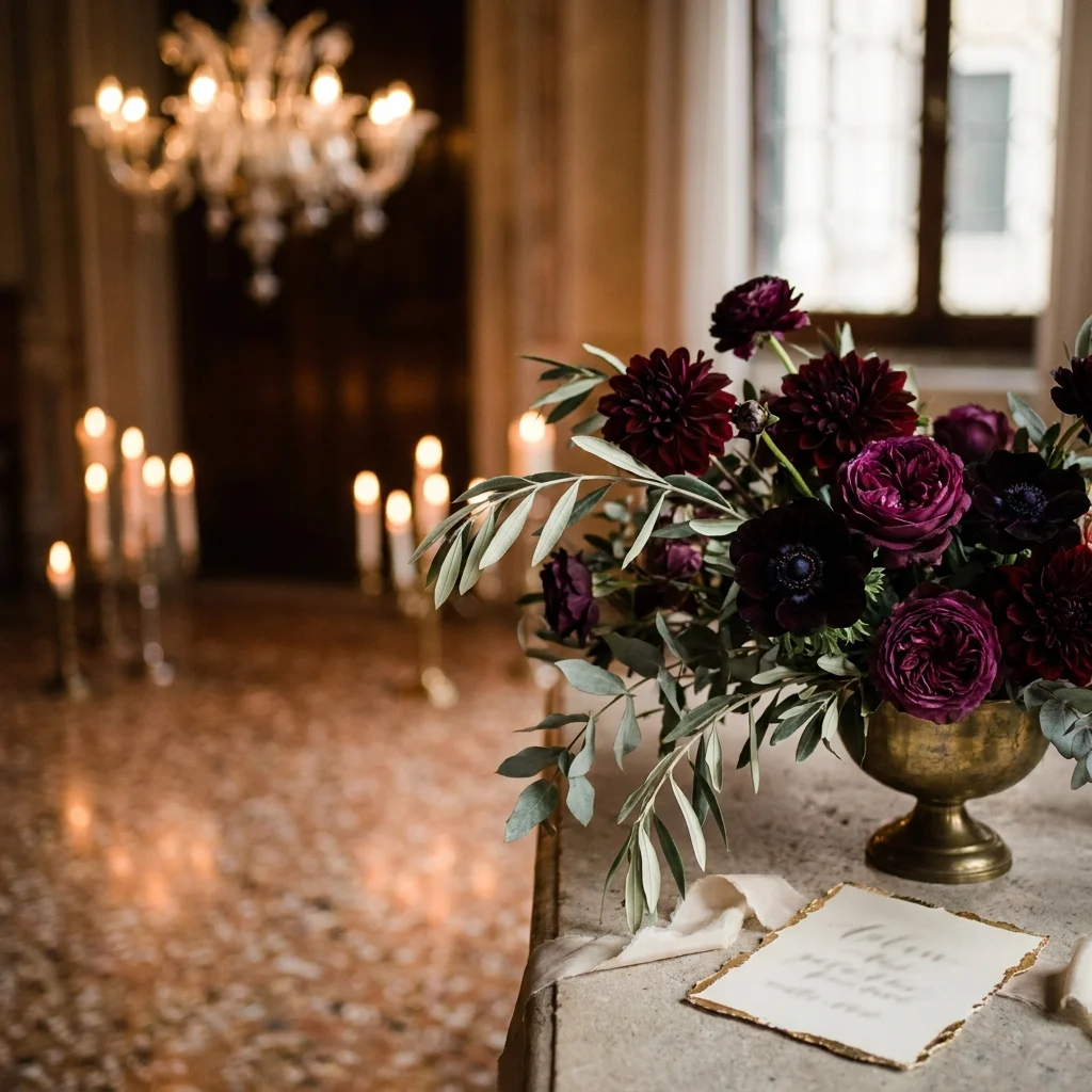
Venetian Jewel: Burgundy, Deep Teal, Gold Leaf, Ivory
Best for: October–December weddings in Venetian palazzi and candlelit interiors. Venice rewards saturated, moody tones that other Italian regions cannot support. The frescoed ceilings, Murano glass chandeliers, and terrazzo floors create a backdrop that absorbs and amplifies jewel tones. We use real gold-leaf accents on place cards, menus, and ceremony programs. Florals shift to dahlias, anemones, and dark garden roses. This is the only Italian wedding color palette in our repertoire where we actively recommend candlelight as a design element rather than mere ambiance. The investment framework for a Venice wedding typically accounts for the higher floral and décor costs these richer tones require.
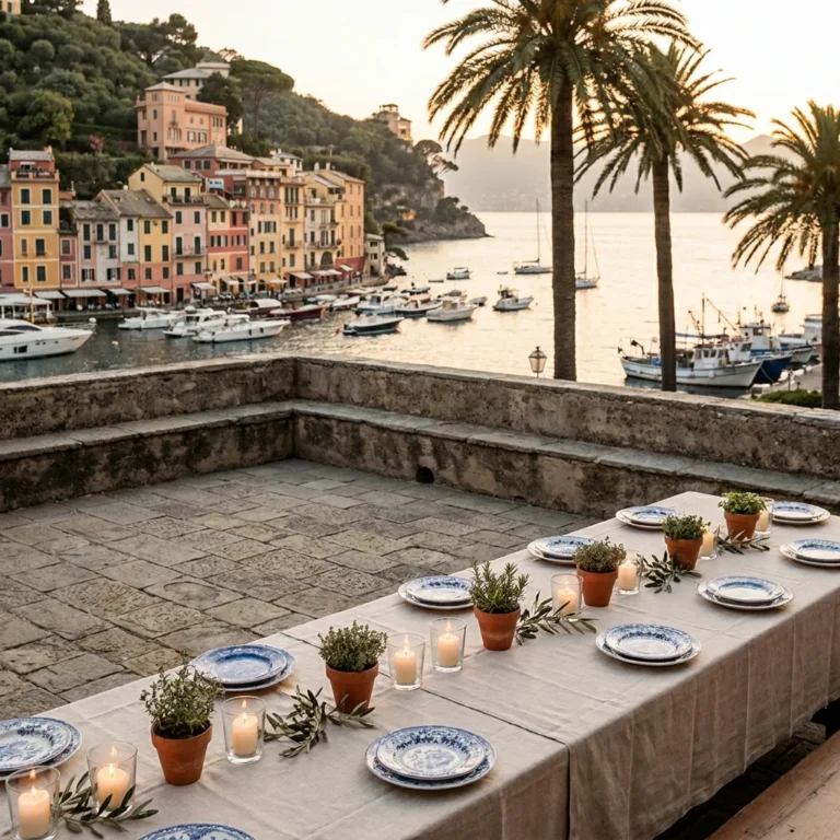
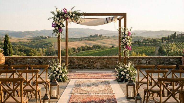
Roman Garden: Olive Green, Dusty Rose, Warm White, Aged Bronze
Best for: April–June weddings at Rome’s historic venues and private garden estates in Lazio. This palette leans into the overgrown, romantic quality of Roman gardens—wisteria-draped pergolas, crumbling travertine, wild rosemary hedges. We keep florals loose and slightly undone: garden roses, sweet peas, trailing smilax. The bronze metallic appears in lanterns, vintage candelabras, and menu holders. This scheme photographs beautifully because the green tones provide natural contrast for skin tones in portraits, and the warm white prevents the palette from reading cold in shaded garden settings.
Modern Italian: Warm White, Soft Sand, Black Accents, Single Bloom
Best for: year-round weddings at contemporary venues, minimalist villas, or Versilia coast properties. Not every couple wants color. Some want architecture and light to do the work. In this scheme, we strip the palette to near-monochrome and introduce a single floral species—usually white phalaenopsis orchids or calla lilies—as the only organic element. Black appears in typography, ribbon, and napkin details. This is the most photography-dependent palette: it lives or dies on the quality of light, which is why we coordinate ceremony timing to the minute with the photographer and venue.
How We Coordinate Palette, Photographer, and Light Conditions Before a Single Flower Is Ordered
Here is the timeline most planning teams skip. Eight to ten months before the wedding, once the venue and season are confirmed, our team initiates a three-way design alignment between the floral designer, the stationery atelier, and the destination wedding photographer. The photographer receives the proposed palette as a digital color deck—not a mood board, but precise Pantone references—along with venue photographs taken at the same time of day as the ceremony and reception.
Why does this matter? Because a photographer who knows the palette in advance can advise on two critical decisions. First: whether the bride’s gown tone (warm ivory vs. cool white vs. champagne) will harmonize or compete with the linen and floral tones in wide reception shots. Second: whether the accent color will hold saturation under the specific light conditions of the venue. A deep burgundy accent that looks spectacular in overcast Venetian light can blow out to muddy brown under direct Tuscan sun at 2 p.m.
This coordination is invisible to the couple. That is the point. The result is a set of wedding images where every element—dress, flowers, table, backdrop—appears to belong together without effort. It is the difference between a beautiful wedding and an editorial one.
Spring, Summer, and Autumn: How Season Shapes the Italian Wedding Color Palette More Than Taste Does
Personal preference matters, but season overrides it. This is a statement our U.S. clients typically push back on during the first consultation—and then agree with completely once they see the evidence.
Spring (April–May): Light is soft, slightly cool, and arrives at a lower angle than summer. Pastels perform well. Greens are vivid and fresh—newly leafed vines, wisteria in bloom, wild poppies in Tuscan fields. This is the season for blush, lavender, soft peach, and ivory. Heavy jewel tones feel out of place because the landscape is light and alive.
Summer (June–August): Light is intense, warm, and overhead from 11 a.m. to 4 p.m. Saturated colors can wash out in direct sun. We favor warm neutrals with one strong accent—citrus yellow against white, for example, or deep olive against sand. Couples planning a beach wedding in Italy during summer months benefit most from high-contrast palettes that hold their structure in bright, reflective conditions.
Autumn (September–November): The golden hour extends, light turns amber, and the Italian landscape shifts to rust, ochre, and deep green. This is the most forgiving season for rich palettes—burgundy, terracotta, forest green, mustard. Floral availability expands to include dahlias, chrysanthemums, and dried elements. Our team references the Italian wedding calendar to align palette decisions with both seasonal light and vendor availability windows.
Beyond Décor: How Color Guides the Guest Experience From Arrival to Last Dance
An Italian wedding color palette is not a decorating exercise. It is an experience-design tool.
Consider the arrival moment. Guests step out of a shuttle onto a gravel drive. What they see first—a pair of planted urns, a draped archway, a welcome sign—establishes the visual register for the entire evening. If those elements carry the palette’s dominant tone, the guest unconsciously understands the aesthetic before entering the venue. This is not decoration. It is wayfinding.
During the ceremony, we position floral installations so they frame the couple from the guest’s seated perspective—not from the photographer’s angle alone. The accent color appears at the altar, drawing the eye forward. At the reception, the palette shifts slightly: the dominant tone moves to linens and lighting, while the accent appears in smaller details—napkin folds, menu cards, dessert garnishes. This graduated reveal keeps the visual story dynamic across five or six hours without ever feeling repetitive.
The final touch is lighting. After sunset, the palette must survive the transition from natural to artificial light. Warm-white uplighting preserves warm palettes; cool-white LEDs destroy them. We specify color temperature (measured in Kelvin) in our lighting briefs to vendors—typically 2700K–3000K for warm palettes and 3500K for cooler coastal schemes. This is the kind of multilingual coordination between Italian lighting technicians and international design expectations that Kiss Me Italy manages as part of the planning process.
To begin a conversation about how we would approach your palette and design brief, contact Kiss Me Italy.
What Italian Wedding Color Palette Design and Execution Actually Costs: Florals, Linens, Stationery
The practical reality of translating a color palette into a physical wedding involves three primary cost categories: florals, linens and tableware, and stationery. Below are indicative ranges based on weddings we have coordinated across Tuscany, the Amalfi Coast, Lake Como, and Venice. All figures reflect 2025–2026 pricing and exclude VAT (IVA at 22%), which is quoted separately on every proposal.
| Floral Design | Price Range (EUR) | Included | Quoted Separately |
|---|---|---|---|
| Intimate (20–40 guests) | €3,500–€7,000 | Bridal bouquet, 1 ceremony installation, 4–6 table centrepieces, boutonnières | Delivery logistics outside venue municipality; second ceremony setup; breakdown after midnight; VAT |
| Mid-size (50–80 guests) | €7,000–€15,000 | Bridal bouquet, 2 ceremony installations, 8–12 centrepieces, welcome-area florals, boutonnières and bridesmaid bouquets | Overhead floral canopy; imported peonies outside May–June season; VAT |
| Grand (100+ guests) | €15,000–€35,000+ | Full ceremony arch, multiple reception installations, suspended arrangements, staircase garlands, cocktail-area florals | Rare or out-of-season blooms requiring international sourcing; multi-venue setups; VAT |
Indicative ranges. Contact Kiss Me Italy for a personalized proposal.
| Linen & Tableware Rental | Price Range (EUR) | Included | Quoted Separately |
|---|---|---|---|
| Standard luxury (fine cotton, ceramic chargers) | €1,500–€4,000 | Tablecloths, napkins, charger plates, and runner or overlay for up to 10 tables | Custom-dyed linens; gold or silver flatware upgrade; glassware beyond standard; delivery outside region; VAT |
| Bespoke (hand-dyed linen, artisan ceramics) | €4,000–€10,000+ | Custom-color tablecloths, artisan-made ceramic plates, hand-pressed napkins, coordinated runners | Breakage insurance; multi-event setups (rehearsal dinner + wedding); VAT |
Indicative ranges. Contact Kiss Me Italy for a personalized proposal.
| Stationery Suite | Price Range (EUR) | Included | Quoted Separately |
|---|---|---|---|
| Digital design + Italian letterpress printing | €800–€2,500 | Save-the-date, invitation, RSVP card, day-of menu, place cards (up to 80 guests) | Wax seals, hand calligraphy, custom envelope liners, programs; shipping to international addresses; VAT |
| Full bespoke (hand-painted, custom illustration) | €2,500–€6,000+ | Illustrated invitation suite, venue watercolor, monogram design, full day-of paper suite | Additional languages; foil stamping; ribbon and assembly; VAT |
Indicative ranges. Contact Kiss Me Italy for a personalized proposal.
For couples evaluating overall destination wedding budgets, our comprehensive Italy wedding cost guide provides broader context on how design-related line items fit within the total investment. A Tuscany-specific cost breakdown is also available for couples focused on that region.
A September Evening Outside Siena: What Palette Cohesion Looks and Feels Like in Practice
Let me describe a wedding we coordinated last autumn, because it illustrates every principle above in a single evening.
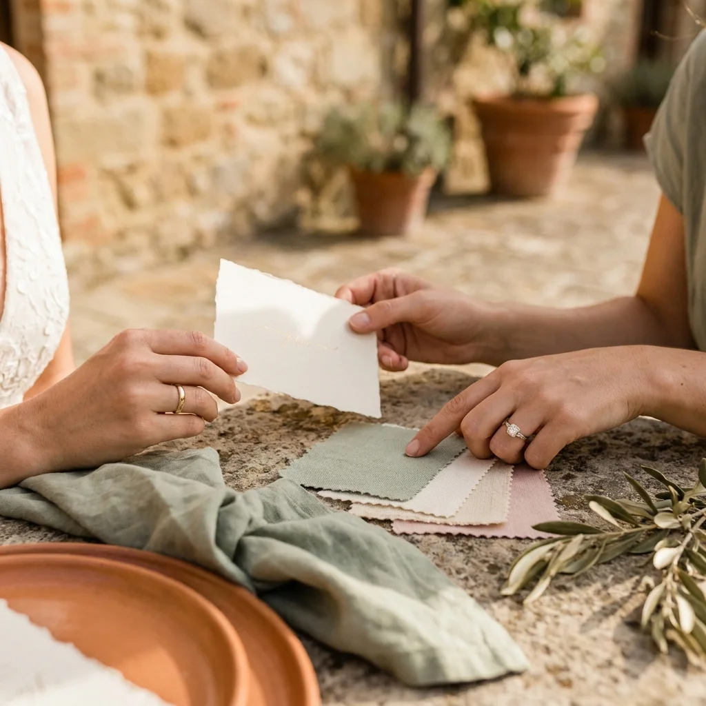
The venue was a private estate in the hills south of Siena—stone walls the color of raw honey, a cypress-lined drive, a courtyard with a centuries-old well. The couple, arriving from Chicago, had initially wanted a lavender-and-white palette inspired by images from a Provençal wedding. During our first on-site review in January, we walked the courtyard at 4 p.m. and held lavender fabric samples against the stone. The effect was jarring. The cool purple fought the warm yellow undertone of the walls. It looked imposed rather than native.
We proposed a shift: terracotta, sage, warm ivory, with aged-gold accents. The couple hesitated. It felt “too brown” on screen. So we returned in March with physical samples—a sage-green linen napkin, a terracotta ceramic plate, a sprig of dried olive—and arranged them on a table in the courtyard at 5 p.m. The effect was immediate. The colors didn’t decorate the space. They belonged to it.
On the wedding day, the ceremony took place at 5:30 p.m. under a simple arch of olive branches and garden roses in muted apricot. The photographer, who had received the palette deck six months earlier, positioned the couple so the setting sun backlit the arch without washing out the floral tones. At dinner, terracotta chargers sat on sage runners, and hand-torn menu cards in warm ivory carried gold-foil text. The lighting designer set the uplights to 2700K. By 9 p.m., the courtyard glowed as if lit by firelight. The bride told us later that her mother cried not at the ceremony, but at the moment she walked into the reception and saw the tables.
That is what a managed Italian wedding color palette delivers. Not decoration. Emotion.
From Initial Inquiry to Final Linen Selection: The Timeline of a Palette Design Brief
Our process follows a clear timeline. Understanding it helps international couples appreciate why early engagement matters—and why we ask for venue confirmation before palette work begins.
12–14 months before: Initial inquiry and venue shortlisting. We do not discuss palette until the venue is confirmed, because the venue’s materials dictate the palette’s foundation. Couples exploring options can review our curated venue guide to understand how different settings shape design possibilities.
10–12 months before: Palette concept development. We create a digital color deck (Pantone-referenced, not Pinterest screenshots) and present it alongside venue photographs. The deck includes primary tone, secondary tone, metallic anchor, accent, and suggested floral species. Revisions happen here—not later.
8–10 months before: Vendor alignment. The floral designer, stationery atelier, linen supplier, and photographer all receive the approved palette deck. We coordinate a multilingual briefing (many Italian vendors operate in Italian only; Kiss Me Italy bridges communication with English-speaking couples) to ensure every vendor interprets the palette identically.
4–6 months before: Physical sampling. Fabric swatches, floral mock-ups, and printed stationery proofs are reviewed on-site at the venue. Adjustments are made based on real-light conditions. This is the most critical quality-control step in the entire process.
2–4 weeks before: Final confirmation. Quantities locked, delivery logistics confirmed, setup timeline finalized. Lighting color temperatures specified. Day-of coordination schedule distributed to all vendors.
Day of: Our team supervises setup, verifying that every linen, floral arrangement, and paper element matches the approved palette. Adjustments are made in real time if needed—a centrepiece shifted to avoid a shadow, a runner re-pressed after transport.
To start this process for your wedding, reach out to our team.
An Italian Wedding Color Palette Is a Design Decision—Not a Decorating One
The difference between a wedding that looks beautiful and one that feels inevitable comes down to whether the color palette was chosen in isolation or designed in context. Context means venue materials, seasonal light, floral availability, photography conditions, and guest-experience flow. It means coordination across five or six vendors who speak different languages and work in different aesthetic traditions.
This is what our team at Kiss Me Italy’s bespoke wedding division manages. Not inspiration—execution. Not a mood board—a design brief with Pantone references, on-site testing, and vendor alignment built into the timeline. The result is a wedding that photographs as beautifully as it felt to attend.
If you are beginning to think about your Italian wedding color palette and want a team that treats it as a design discipline rather than a decorating task, contact Kiss Me Italy to begin the conversation.
Frequently Asked Questions About Italian Wedding Color Palettes
How many colors should we commit to for a luxury Italian wedding?
For a refined result, we typically limit the working palette to 3–5 tones: one dominant, one secondary, one neutral anchor, one metallic, and (optionally) a single accent used sparingly. More than that tends to read as “decor” rather than a cohesive design language in photographs.
Will the venue’s existing chairs, floors, and wall colors force our palette?
They set the baseline. We treat fixed elements—stone tone, fresco colors, terrace tile, existing seating—as non-negotiable “built-in colors,” then design the palette to harmonize rather than fight them. When a fixed element is visually dominant, we either rent replacements (chairs/linens) or shift the palette so the venue reads intentional, not accidental.
How do you prevent bridesmaid dresses from looking mismatched across different lighting (sunset vs. candlelight)?
We specify fabric type and undertone—not just a color name. Some dyes skew cooler under daylight and warmer under tungsten. We recommend dress swatches (or a single test dress) reviewed against the venue at the ceremony time, then confirm lighting temperature so the dresses remain consistent from portraits through the last dance.
Can we keep the palette elegant if we want a statement installation (e.g., a floral ceiling or dramatic aisle)?
Yes—by keeping the statement piece tonal. We often design the installation in the dominant and neutral tones, then reserve the accent color for controlled, high-impact moments (altar detail, place setting, or bar styling). This preserves luxury restraint while still delivering a memorable focal point.
Is VAT included in the design and floral pricing ranges listed above?
No. All pricing ranges in this article exclude Italian VAT (IVA), which is currently 22%. VAT is itemized separately on every proposal we issue so couples can compare quotes transparently.
Planning something special in Italy? Read also our guide: Capri Proposal Italy: Iconic Spots, Private Boat Options & Luxury Photography.